Ethereum Rich List by Aggregated USD Holdings: How Capital Moves and Where Risks Emerge
This is Part 2 of a two-part analysis.
In Part 1, we showed where capital sits across Ethereum.
Here, we focus on how that capital behaves - how it moves, concentrates, and generates risk.
About This Report
This report uses an aggregated ranking of Ethereum addresses based on totalBalanceUsd, which includes ETH, ERC-20 tokens and stablecoins valued in USD. This ranking departs from existing approaches, which have traditionally sorted addresses by ethBalanceUsd.
The Beacon deposit contract and token contracts are excluded to focus on economically meaningful holders.
The key signals from capital dynamics
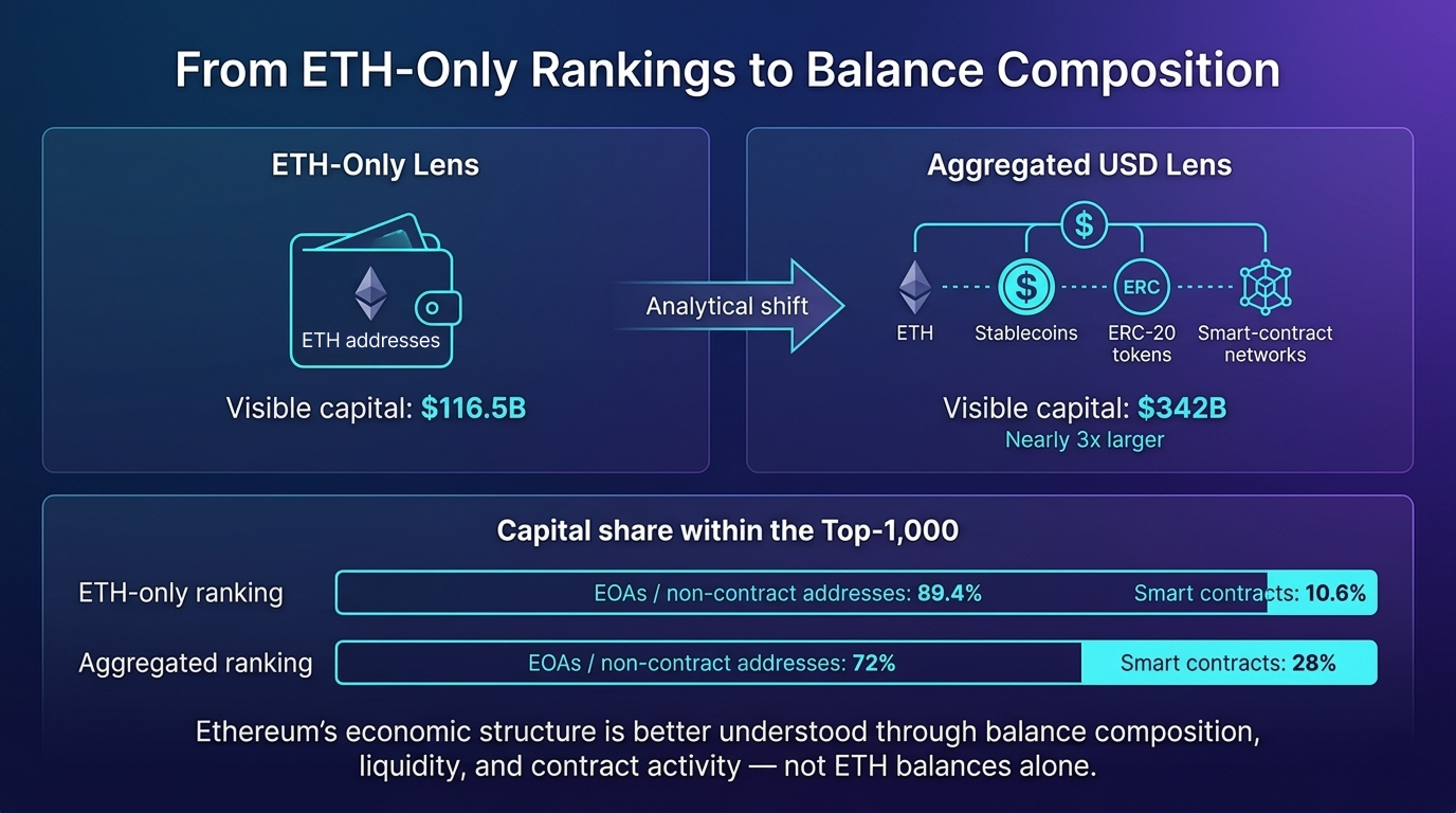
Looking at ETH balances alone obscures most of Ethereum’s real capital.
Rebuilding the rich list by total USD value (ETH + ERC-20 + stablecoins) fundamentally changes the picture:
- Smart contracts jump from 10.6% (ETH-Rank) to almost a third of the capital in the Aggregated Top-1000
- Addresses in the aggregated ranking are about 25% more active than those in the ETH-only ranking, with nearly 2× larger balance changes
- The top 5% of addresses drive extreme volatility - 25% weekly changes in the aggregated ranking versus ~11% in ETH-only, concentrated in exchange-controlled liquidity hubs
- PPI (Printing-Press Index) reveals who holds real value and who sits on self-minted tokens
Aggregated List shows that power in the network increasingly lies with liquidity, rather than ETH itself.
In other words: the classic ETH rich list describes where value once rested; the aggregated rich list shows where it is actually moving.
Smart Contracts vs. HODLers - Are the biggest whales partly code?
Smart contracts become significantly more visible once the ranking is rebuilt by total USD value. In the Aggregated Top-1000, there are 2.7x more contracts than in the ETH-only list (267 vs 99), and they represent roughly 28% of total capital - compared to 10.6% under an ETH-based view.
In other words: The ETH top represents accumulation, while the Aggregated top represents the "living code" - DeFi, bridges, and pools where funds flow.
In Ethereum, capital is managed not only by people, but also by code - thus realizing Vitalik Buterin's original vision “Ethereum: The Ultimate Smart Contract and Decentralized Application Platform” (2013 whitepaper).
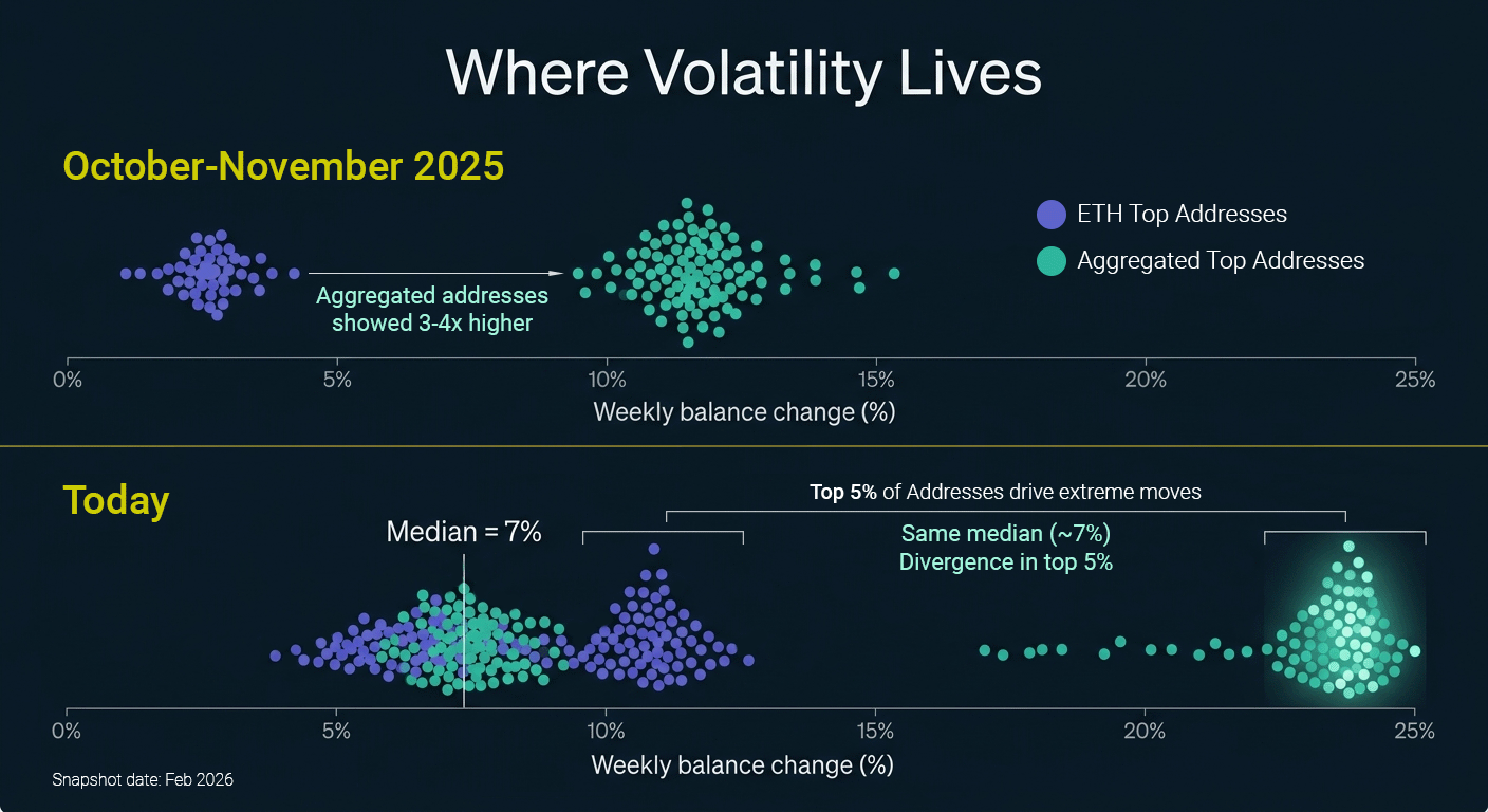
The Beating Heart of Ethereum: Where Volatility Lives
Ethplorer compared weekly activity and balance changes across Aggregated ranking and ETH-only to identify where active capital concentrates. Aggregated addresses are consistently more active, especially near the top.
- Activity: 67% of Aggregated addresses transact weekly vs 53% in the ETH Top
- Weekly balance changes: median $26.1M vs $14.2M (≈1.84×)
- More active addresses are also more likely to hold stablecoins (correlation ≈ +0.4)
In October–November 2025, Aggregated addresses showed 3-4× higher volatility (11.5% vs 2.7%), reflecting active altcoin rotation within token-heavy portfolios.
Today, median weekly volatility is similar across rankings (~7%).
The divergence now sits in the head: in the Top-100, the 95th percentile reaches ~25% in Aggregated vs ~11% in ETH-only. These extreme moves are concentrated in the top 5% cluster in large exchange and liquidity-hub wallets - where ETH is converted into stablecoins and redistributed.
This aligns with the broader capital shift: in late 2025 Aggregated totals exceeded ETH-only by 2.2× ($426B vs $189B); today the gap approaches 3× ($342B vs $116.5B). Pure ETH exposure continues to decline relative to token and stablecoin balances, indicating structural capital redistribution rather than short-term trading noise.
The Printing-Press Index: Measuring Self-Minted Wealth
To separate real capital from self-minted tokens, will be used PPI (Printing-Press Index):
PPI = Own tokens (USD) / Total tokens (USD) - the share of a project’s own tokens in its portfolio.
TOP-100 Group-level results:
DeFi shows ~2.1× higher mean PPI than CEX (14.7% vs 6.9%), indicating greater reliance on self-issued tokens.
Bridge/L2 is even higher at 34.8% PPI - 2.4× above DeFi and ~5× above CEX - which is partly structural, as bridges require liquidity providers to stake native tokens. However, this does not reduce risk, but shifts it to dependence on token price.
Also, about a quarter of DeFi addresses have PPI >50% (vs just over 10% in CEX), while over half of Bridge/L2 addresses exceed 75% PPI.
To understand how much of a holder’s capital is composed of self-issued tokens, addresses were ranked by PPI. The “Rank” column shows each address’s position in the overall capital leaderboard (sorted by total USD balance).
Top-5 Project Addresses with the Highest PPI in Ethereum Top-100:
| # | Project | PPI | Self-minter tokens | Rank (by totalBalanceUsd) |
|---|---|---|---|---|
| 1 | World Liberty Fi | 100% | 1.1B WLFI | 35 |
| 2 | Uniswap | 100% | 984.4M UNI | 36 |
| 3 | Bitget | 100% | 579M BGB | 63 |
| 4 | Worldcoin | 94.3% | 624M WLD | 50 |
| 5 | Crypto.com | 35.3% | 238M CRO | 39 |
In these cases, the majority of the address balance consists of the project's own token rather than independent assets. For example, the leader of the table: World Liberty Financial (0xfef3...14b4): ~$1.1B in WLFI → PPI ≈ 100% and is ranked 35th in the Aggregate Rating.
World Liberty Financial is not only the PPI-top single-address case, but also stands out at the ecosystem level - across all 4 addresses, the project is almost entirely backed by its own token (~92%).
A similar pattern appears in Worldcoin, where 9 addresses are self-backed at ~77.7%, and in Bitget, where 21 addresses show roughly 50% dependence on its native token.
In contrast, Uniswap - despite having nearly 90 addresses - shows an aggregate PPI of only ~5%, indicating no meaningful systemic exposure to its own token.
Addresses That Would Enter Top-100 If Own Tokens Were Included
Aggregated Ranking in Ethplorer applies a liquidity filter designed to prevent artificial inflation of rankings through self-issued tokens. While these balances may appear very large in USD terms, they are rarely liquid at the quoted market price.
To avoid overstating real economic power, Ethplorer excludes balances that exceed what could realistically be sold during a short period of market liquidity.
Below we show several real addresses that would enter the Top-1,000 if their own tokens were counted:
| Project | PPI | Self-minter tokens | Rank change | Real rank (by totalBalanceUsd) |
New rank (without spam-filter) |
|
|---|---|---|---|---|---|---|
| Gnosis | 72% | 49.1M | +1846 (!) | 2550 | 704 | |
| Gate.io | 80.4% | 106.6M | +424 | 704 | 280 | |
| Gnosis | 60.9% | 181.3M | +252 | 409 | 157 | |
| Bitfinex | 100% | 5.85B | +93 | 97 | 4 (!) | |
| Gate.io | 42.4% | 168.0M | +38 | 86 | 48 | |
| Bitfinex | 20.6% | 80.4M | +20 | 119 | 99 |
The rank reconstruction reveals how dramatically self-issued tokens can distort the perceived economic weight of some addresses. The most extreme case is a Gnosis address (0x849d…039d), which would jump from rank 2,550 to rank 704, a shift of 1,846 positions if the filtered tokens were counted. At the same time, the most striking pseudo-surge occurs with Bitfinex (0xc61b…193c): without the filter, this address would leap from rank 97 to rank 4, effectively appearing as one of the top five richest addresses on Ethereum.
PPI → proxy for wrong-way risk
As Ethereum’s economy shifts toward tokens, balance size becomes a weaker indicator of risk. High PPI introduces a well-documented structural risk known as wrong-way risk - where a system’s stability depends on the value of its own token.
At low levels (roughly 10-20%), self-issued tokens function as a design feature. Beyond ~40-50%, the system enters a fragile regime: modest external pressure can impair confidence, compress liquidity, and trigger reflexive sell-offs characteristic of a death-spiral dynamic. At this point, PPI shifts from a descriptive metric to a signal of systemic vulnerability.
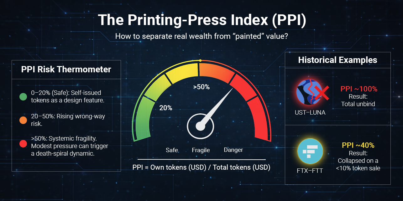
The UST-LUNA collapse represents the extreme case. UST was effectively backed by LUNA itself, resulting in a PPI near 100%. When several billion dollars exited the system and the peg weakened, the protocol attempted to restore balance through additional LUNA issuance. This rapidly diluted supply, collapsed price, erased backing, and led to a full unwind within days - a textbook death spiral.
The FTX-FTT case shows that even non-extreme PPI levels can be destabilizing. Leaked balance sheets suggested that roughly 40% of Alameda Research’s assets were denominated in FTT. The collapse was triggered not by mass liquidation, but by Binance’s announcement to sell ~$550M of FTT - less than 10% of the token volume recorded on Alameda’s balance sheet. In conditions of thin liquidity and declining confidence, this was sufficient to trigger a rapid price collapse, a bank run, and systemic failure.
Conclusion
In a token-heavy market, what matters is no longer how big a balance is, but what it consists of. PPI provides a practical filter for assessing balance-sheet quality, separating externally sourced capital from value amplified through self-issuance. As structural dominance shifts and prices become range-bound, the market focus shifts from chasing “gems” to managing risk. For analysts and investors, monitoring how capital is composed - rather than how fast it grows - becomes central to evaluating resilience, concentration, and risk.
Final Insight: Capital Dynamics in a Post-ETH Market
Once capital is viewed in Aggregated terms, the key question is no longer where it sits, but how it behaves.
Activity, volatility, and balance composition reveal a system where capital flows through a small number of liquidity hubs, and risk concentrates in specific structures rather than across the market as a whole:
- Balance size is no longer a proxy for resilience.
High PPI levels show that large balances can be internally reinforced by self-issued tokens, creating wrong-way risk even in systems that appear well-capitalized. - Exposure analysis must shift from narratives to balance composition.
Evaluating protocols now requires inspecting aggregated balances, address attribution and self-issued exposure - not just TVL, token price or brand perception. - Smart contracts have become capital actors.
In the Aggregated Top-1,000, contracts are 2.7× more numerous than in the ETH-only list and represent roughly 28% of total capital. Ethereum’s largest holders are no longer just people - they are more and more systems. - Capital flows are highly concentrated.
The top 5% of addresses drive the largest balance movements and volatility spikes, primarily within exchange and liquidity-hub wallets.
The Ethereum rich list is no longer a ranking of wealth - it is a map of capital flows and embedded risk.